
Breaking the Financial Literacy Barrier for Young Adults

Setting the Scene
Managing personal finances and building essential life skills can feel overwhelming—especially for young adults navigating work, school, and personal responsibilities. With an increasing number of financial tools and self-improvement platforms available, many struggle to find reliable, accessible resources tailored to their needs.
The YMCA recognized this challenge and set out to create a virtual portal designed to empower young adults with practical financial education and career-building tools.
About the YMCA
✔ Mission: The YMCA has long been dedicated to strengthening communities through programs that support education, well-being, and personal development.
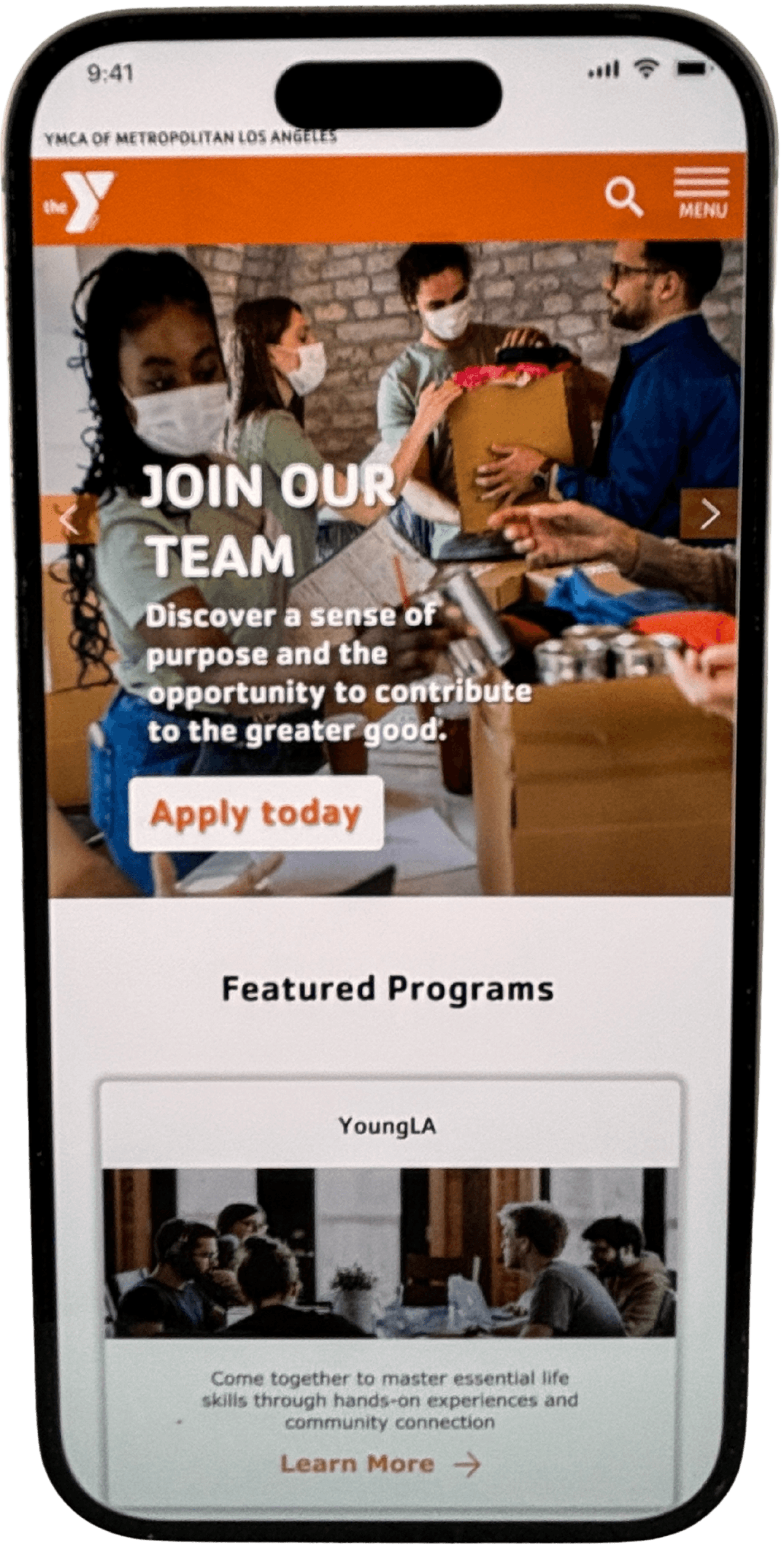
✔ The Initiative: They wanted to create a virtual platform specifically for low-income young adults in Los Angeles, making financial literacy and career development more engaging and accessible.
✔ Measuring Success: The goal was to determine if young adults actively engaged with the portal and found it valuable in their financial and professional journeys.
The Business Challenge
🔹 Why This Initiative?
✔ The YMCA recognized that young adults (18-29) were struggling to access reliable, practical financial education and career-building tools.
✔ Many low-income individuals lacked support systems and felt isolated in their journey toward financial independence.
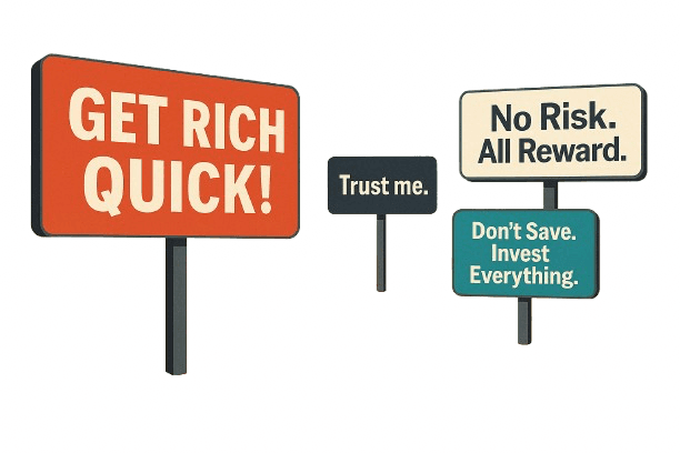
✔ Traditional financial literacy resources felt complex, impersonal, and overwhelming, discouraging engagement.
🔹 The Core Challenge:
✔ How might we help young adults build financial confidence and essential life skills without making the process feel like a chore?
✔ How might we integrate a sense of community into learning so users don’t feel like they’re going at it alone?
UX Challenges - What wasn't working
Before we could build a better experience, we had to understand what wasn’t working for young adults interacting with YMCA’s digital tools. Through research and testing, we uncovered a range of barriers that made their journeys feel scattered, inefficient, and unsupported.
❌ No Clear Starting Point - There was no centralized hub—resources were spread across sections, causing confusion.
❌ Overwhelming & Inaccessible Content - Long pages and cluttered layouts weren’t mobile-friendly and often led to drop-off.
❌ Lack of Guidance or Support - No clear path to get help or talk to someone—users felt alone in the process.
❌ Not Designed for Their Reality - Many users had limited data plans or no desktop access. The experience didn’t adapt to that.
From Problems to Solutions
Understanding the financial challenges young adults faced, we needed to ensure our design not only provided information but also gave users a structured, engaging, and community-driven learning experience. Instead of simply presenting financial resources, we reframed the approach—empowering users to take action, connect with others, and build confidence in their financial future.
How Might We Reframe the Problem?
We structured the our ideation (How Might We) to shift focus from obstacles to opportunities for design solutions.
✔ How might we make financial learning feel less overwhelming?
✔ How might we create a sense of community and support?
✔ How might we help users apply financial skills in real life?
Key UX Priorities
What We Focused On
From research insights and the HMW exercise, we identified three core UX priorities:
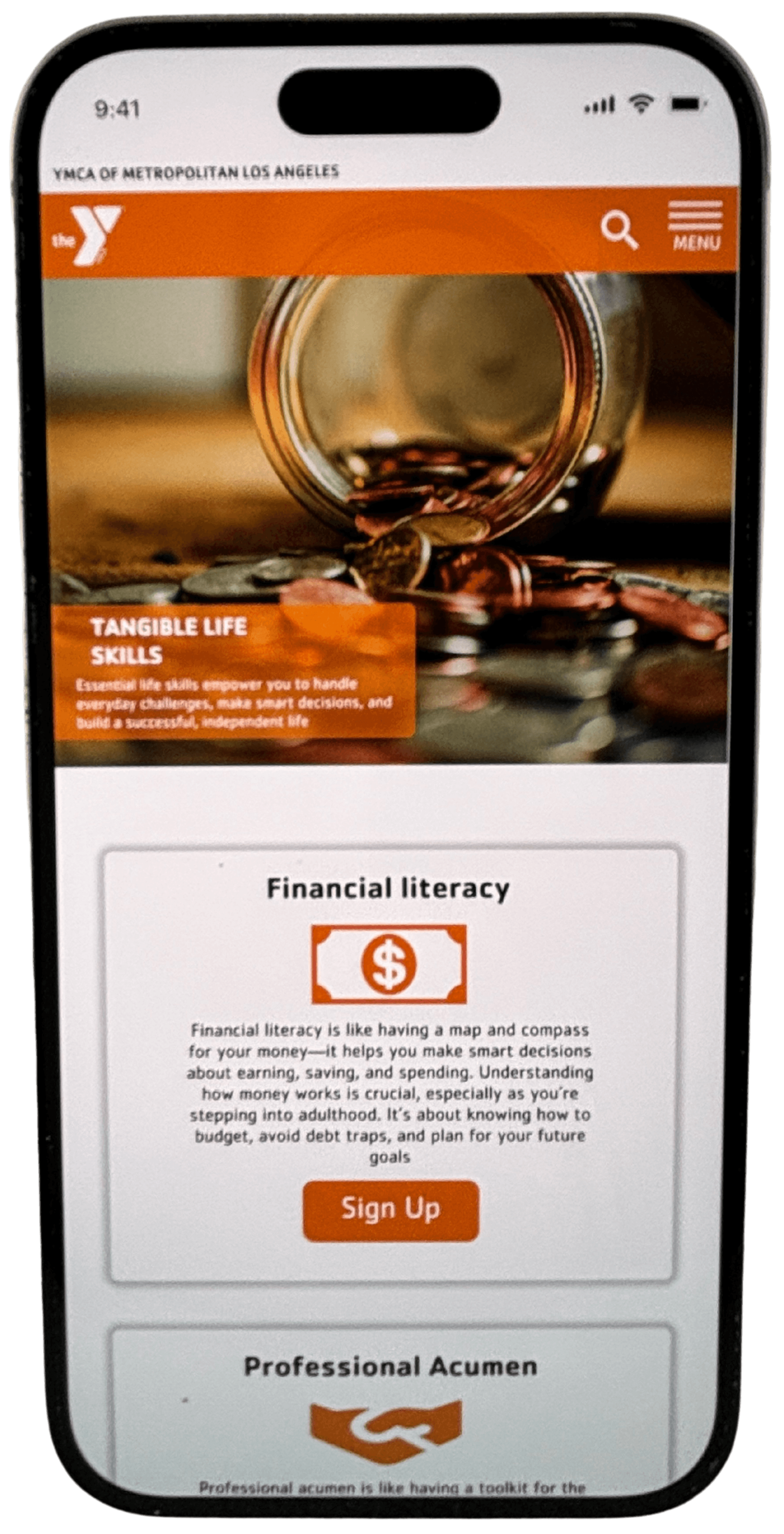
✅ Making Financial Learning Digestible – Using visual storytelling, interactive modules, and structured learning paths.
✅ Creating a Peer-Supported Experience – Encouraging discussion, Q&A features, and community-based motivation.
✅ Ensuring Actionability – Reducing passive content, adding clear next steps, and helping users track progress.
The Approach
To design an effective financial education platform, we needed to deeply understand the challenges young adults face when it comes to money management. Through research, competitor analysis, and user interviews, we identified key pain points and opportunities to make financial learning engaging, accessible, and empowering.
Understanding the Users – What Young Adults Needed Most
🔹 We conducted interviews with young adults (ages 18-29) to understand their financial challenges, behaviors, and mindsets.
🔹 We explored key themes: financial independence, budgeting struggles, and the overwhelming nature of financial literacy resources.
🔹 Through our research, we identified that many young adults felt lost when it came to managing their money but were eager to learn—if the experience was engaging and supportive.
Key User Insight: Many participants expressed feeling frustrated by complex financial tools and wanted a solution that was approachable and easy to use.
Looking at the Landscape
Competitor & Market Analysis
🔹 We studied existing financial education platforms and nonprofit initiatives to understand what was working—and what wasn’t.
🔹 We found that while many platforms offered financial guidance, most lacked a strong community component, which was a key factor in engagement and retention.
🔹 Successful programs focused not just on financial knowledge but also on real-life application and peer-to-peer learning opportunities.
Key Finding: Empowerment and community were equally as important as financial education—young adults wanted to learn, but they also wanted a support system.
Defining the Design Focus
Key UX Goals
🔹 Simplified Financial Guidance – Making financial education intuitive, digestible, and visually engaging.
🔹 Community & Social Connection – Encouraging peer interaction, support, and shared learning experiences.
🔹 Personalized Learning Paths – Allowing users to explore financial topics that were most relevant to their needs.
With these insights in mind, we moved forward with a user-centered approach, ensuring that the design addressed the real challenges young adults faced in their financial journey.
The User Journey
Navigating the Financial Literacy Gap
For many young adults, managing finances isn’t just a skill—it’s a survival tool. Yet, their journey toward financial independence is filled with roadblocks: complex financial jargon, overwhelming resources, and a lack of guidance tailored to their needs.
Delivering Impact
The redesigned platform transformed financial education from an overwhelming process into an accessible, engaging, and user-driven experience. By simplifying complex topics, integrating community-driven support, and focusing on actionability, we helped young adults gain confidence in managing their financial futures.
UX Enhancements That Made a Difference
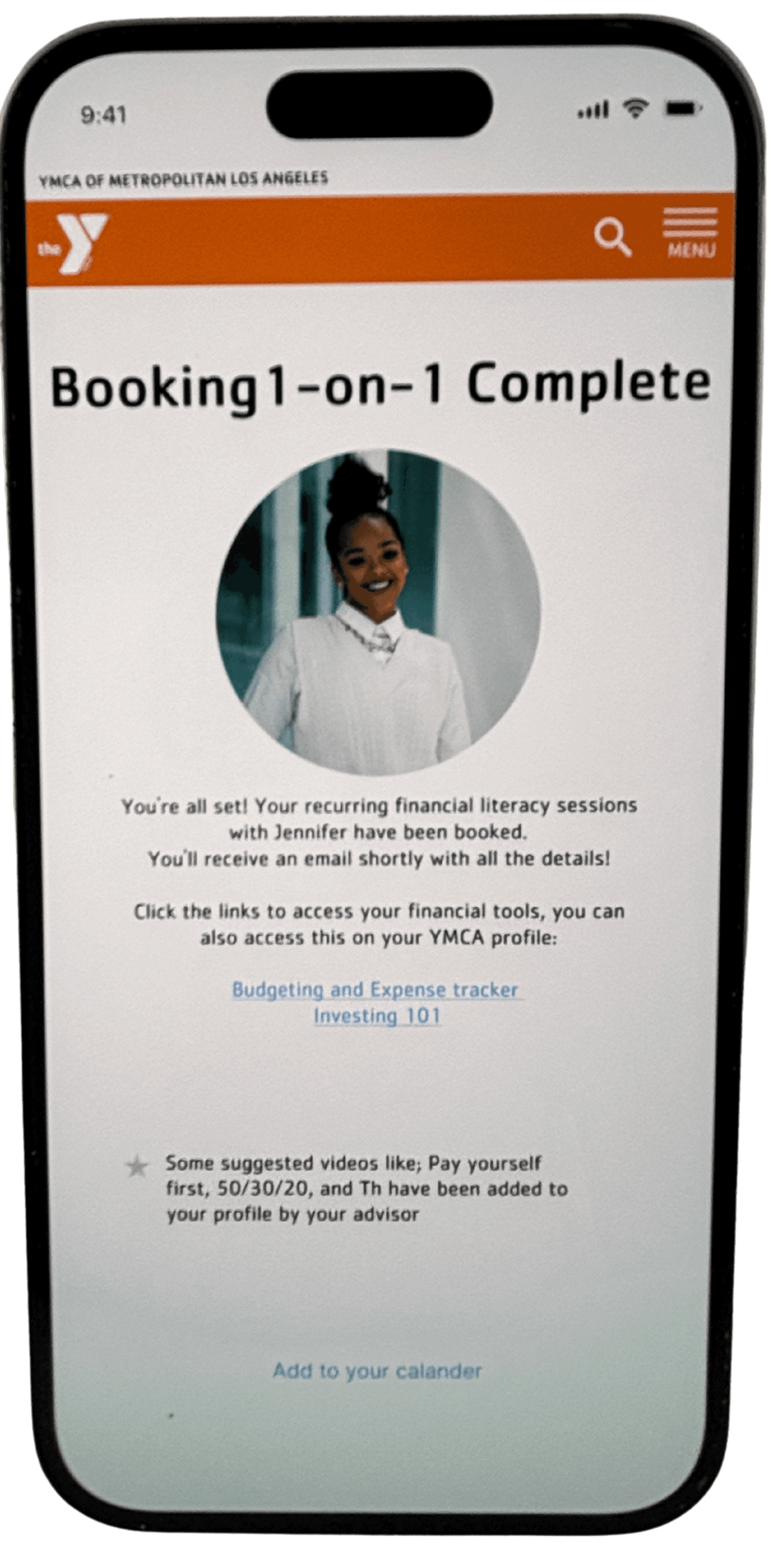
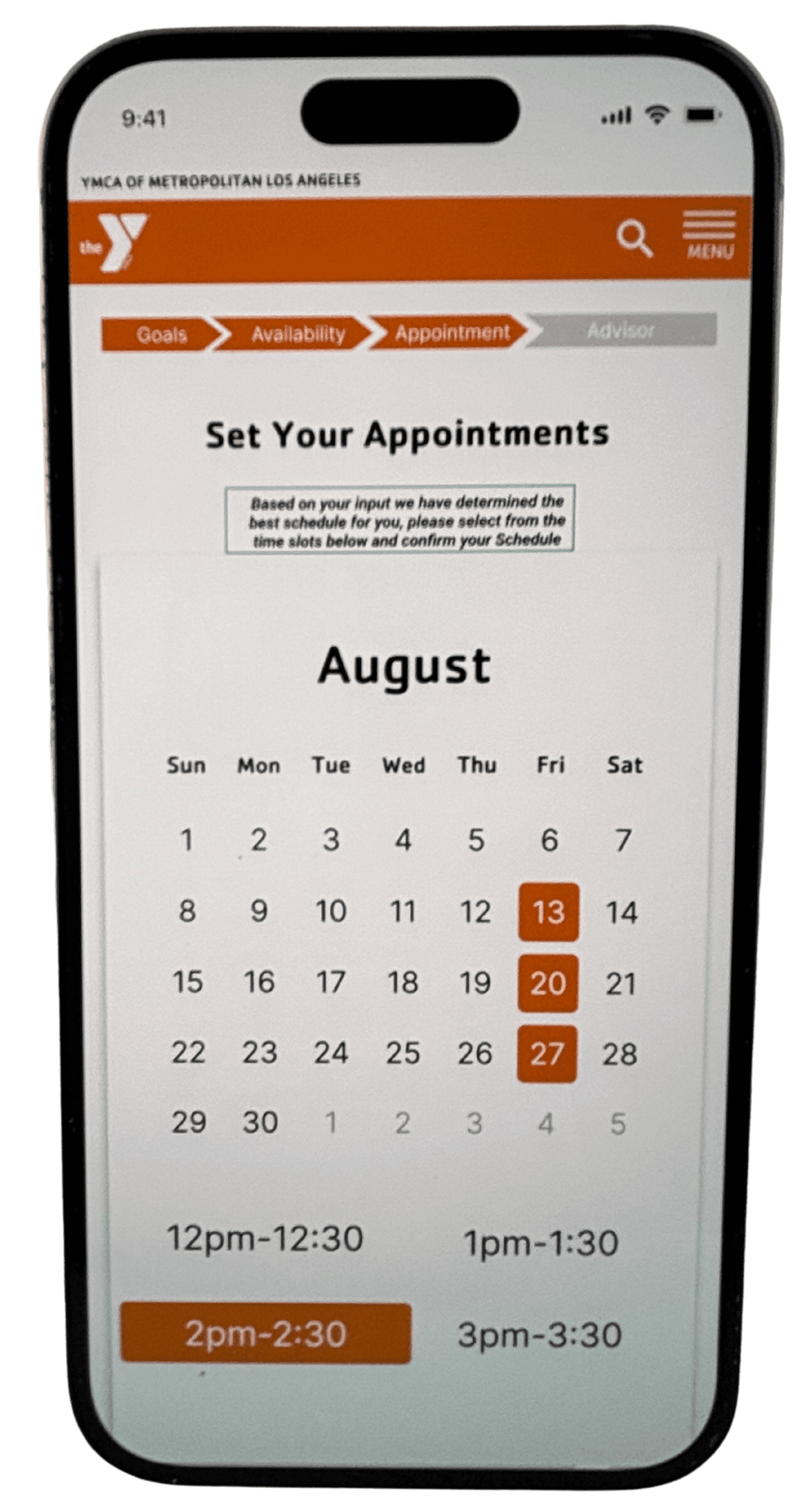
✔ Structured Learning Paths – Users followed a clear, step-by-step approach to financial topics.
✔ Interactive Modules – Instead of passive content, learning became engaging and actionable.
✔ Community Discussion Features – Encouraged peer interaction for support and motivation.
✔ Quick Access to Financial Tools – Users could apply what they learned instantly.
✔ Gamified Progress Tracking – Helping users stay motivated and build confidence over time.
Usability Testing & What We Learned
📌 Participants & Methodology
🧪 Each participant completed key learning & financial planning tasks using the prototype.
📌 Key Insights & User Feedback
🧭 Users wanted more guidance on what to do next.
🤝 Community engagement was a major motivator for continued use.
🏦 Financial tools had to feel trustworthy and credible.
Measurable Improvements
After reshaping the experience around clarity, guidance, and real-life accessibility, the results weren’t just functional—they were felt. Users expressed confidence, momentum, and even joy in the journey they once found overwhelming. Here’s what changed: 🫱🏽🫲🏾 Designed with Empathy
What changed wasn’t just the UI. It was the feeling of being understood. Feedback showed that users finally felt like the tool was made for them.
Usability Test Participant
“Everything’s in one place now. I don’t have to jump around or guess where to start.”
Usability Test Participant
“It feels like this was made for someone like me—not someone with a finance degree.”
Lessons & Key Takeaways
📌 Keeping the Design on Track – Avoiding Costly Rework
The Lesson:
When the happy path isn’t clearly defined early, teams risk backpedaling, reworking designs, and losing precious time fixing misalignment.
Learnings:
✔ Fully explore ideas before diving into high-fidelity—rushing ahead leads to half-baked designs and expensive revisions.
✔ Early sketching, debating, and iteration gave us space to align before execution.
✔ We introduced a "Not the Happy Path" section in Figma to track off-course designs and identify when we were drifting from user needs.
✔ I took on the role of happy path guardian—referencing and refining the user flow to keep our team grounded in user intent.
Why It Matters:
When we prioritize defining the right solution early, we reduce waste later. A strong UX process ensures final designs are intentional, aligned, and user-centered.
📌 Validating Designs Early – Why We Kept It Low-Fidelity
The Lesson:
Usability testing is most powerful when it’s done early and often. Staying low-fidelity as long as possible helped us stay nimble and grounded in user feedback.
Learnings:
✔ Testing early gave us the chance to pivot before investing too much.
✔ Remaining in low-fi allowed for faster iteration, fewer costly fixes, and more learning.
✔ We prioritized sketching and rough wireframes so we could validate ideas quickly—before they got too polished to challenge.
Why It Matters:
Keeping things flexible early on meant we could focus on solving the right problems—not perfecting the wrong solutions.