Helping Families Find the Right Toy, Without the Hassle

Setting the Scene
Shopping for toys should be simple. Parents and grandparents want a seamless experience—where they can browse, compare, and trust that what they buy is exactly what they’ll receive. But for many, online toy shopping is anything but easy. Filters are missing, product descriptions lack clarity, and the checkout process can be confusing.
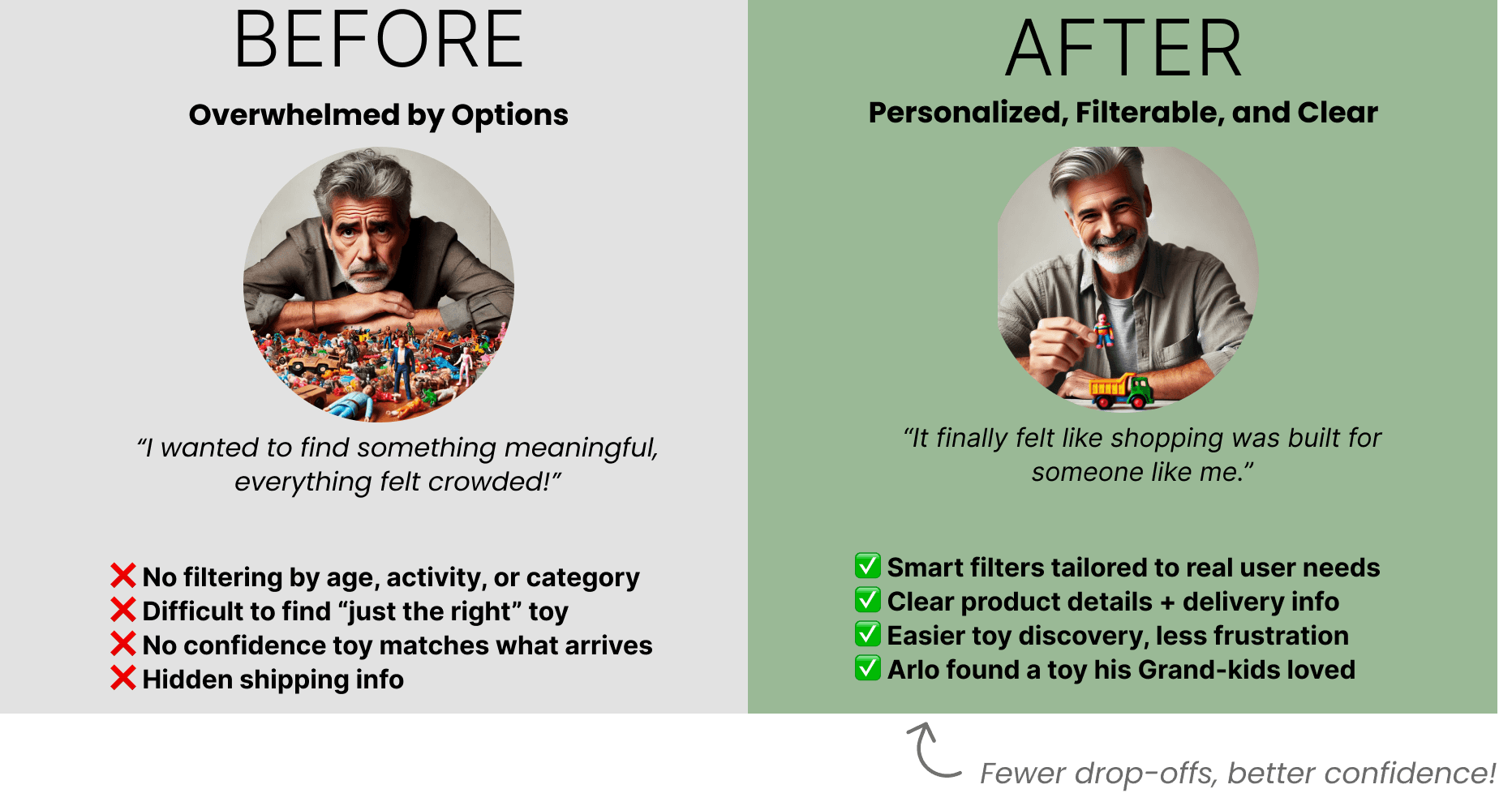
That’s exactly what Arlo experienced. As a grandfather who loves picking out gifts for his grandkids, he found himself overwhelmed—struggling to find the right toy, filtering through too many options, and feeling unsure if what he ordered would actually match what arrived.
About The Dinosaur Store
✔ A local toy store with a passionate small-business identity.
✔ Highly curated inventory, strong community ties, and personal customer service.
✔ They wanted an e-commerce experience that preserved their charm while improving usability.
The Business Challenge
✔ The store needed an online shopping experience that aligned with their brand.
✔ Their existing website had poor navigation, outdated UI, and a lack of trust-building elements.
✔ The owner took pride in the store’s physical customer experience but struggled to translate it online.
Challenges - What Wasn't Working
❌ Hard to Find the Right Toy - No filters for age or activity made browsing slow and frustrating.
❌ Low Trust in Product Info - Vague details left users unsure about what they were buying.
❌ No Clarity on What’s in Stock - Missing inventory status added doubt to purchase decisions.
❌ Checkout Confusion - No guest checkout or shipping info led to drop-offs at the finish line.
The Approach
To redesign The Dinosaur Farm’s e-commerce experience, I first needed to deeply understand both the business and its customers. Through speaking directly with users, heuristics, and competitor benchmarking, I uncovered key user frustrations and identified opportunities to improve search, product discovery, and trust-building—without losing the authenticity of this small business.
Understanding Users
What Toy Buyers Need
🔹 User Research Objective:
"To learn about parents’ experiences regarding buying toys on e-commerce sites—identifying what works, what frustrates them, and what builds trust in online shopping."
🔹 Key User Research Findings:
✔ Parents wanted a seamless way to browse toys by category (age, activity, type).
✔ Product quality mattered most—they didn’t want cheap or third-rate toys.
✔ They sought a clutter-free experience—too many options were overwhelming.
✔ Trust was critical—users needed inventory transparency (is it in stock?), secured payments, and clear return policies.
Competitive Research
What We Learned from Other Toy Retailers
🔹 What I Analyzed:
✔ How other toy retailers structured their navigation, filtering, and product pages.
✔ Which trust signals (e.g., reviews, secure checkout, inventory status) built user confidence.
✔ How competitors balanced modern UX with their brand identity.
🔹 Key Takeaways:
✔ Larger toy retailers excelled in filtering & search, making product discovery easier.
✔ Small businesses leaned on strong storytelling but often lacked UX best practices.
✔ Clear product descriptions & visual consistency helped users make confident purchases.
The UX Priorities – What Needed to Change
🔹 Based on research insights, the redesign focused on:
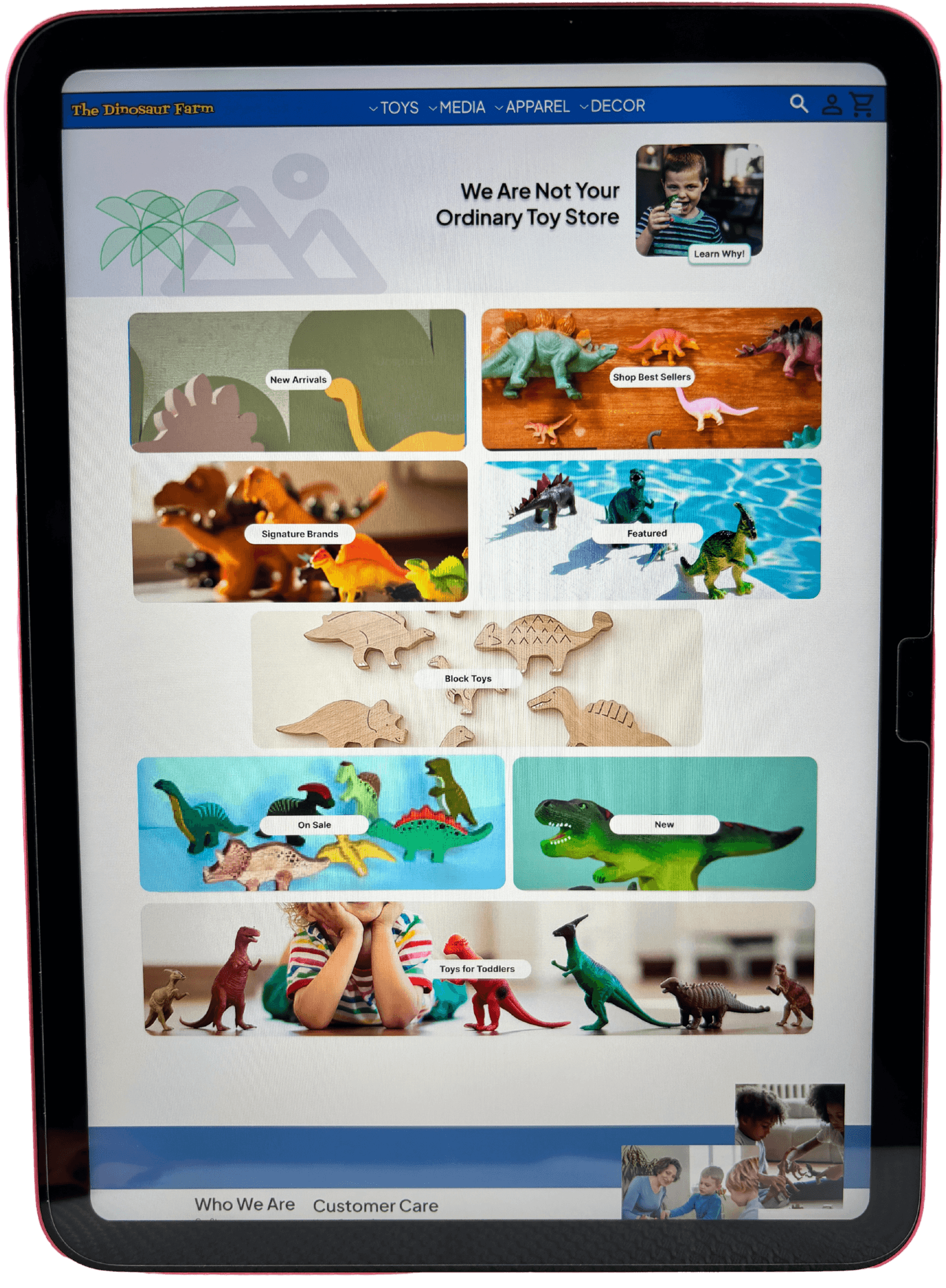
✔ Improved Filtering & Search – Helping users quickly find toys by age, activity, and type.
✔ Enhanced Product Pages – Ensuring clear descriptions, reviews, and trust-building elements.
✔ Streamlined Checkout – Making the purchase process frictionless and transparent.
From Problem to Solution
Understanding the frustrations of online toy shoppers, I framed the design approach around simplifying product discovery, improving purchase confidence, and ensuring a better shopping experience. Through structured problem-solving and UX strategy, I translated research insights into clear, actionable solutions.
How Might We Reframe the Problem?
Key How Might We (HMW) Questions:
✔ How might we make browsing for toys more intuitive?
✔ How might we help parents feel confident in their purchases?
✔ How might we reduce friction in the checkout process?
Before & After: A Journey Reimagined
To highlight the UX improvements made during the Dinosaur Farm e-commerce redesign, I mapped out the full product purchase journey—from discovering the site to confirming a successful order. This diagram compares the original experience (in red) with the redesigned experience (in green), showing how friction was removed and clarity added across the entire flow.
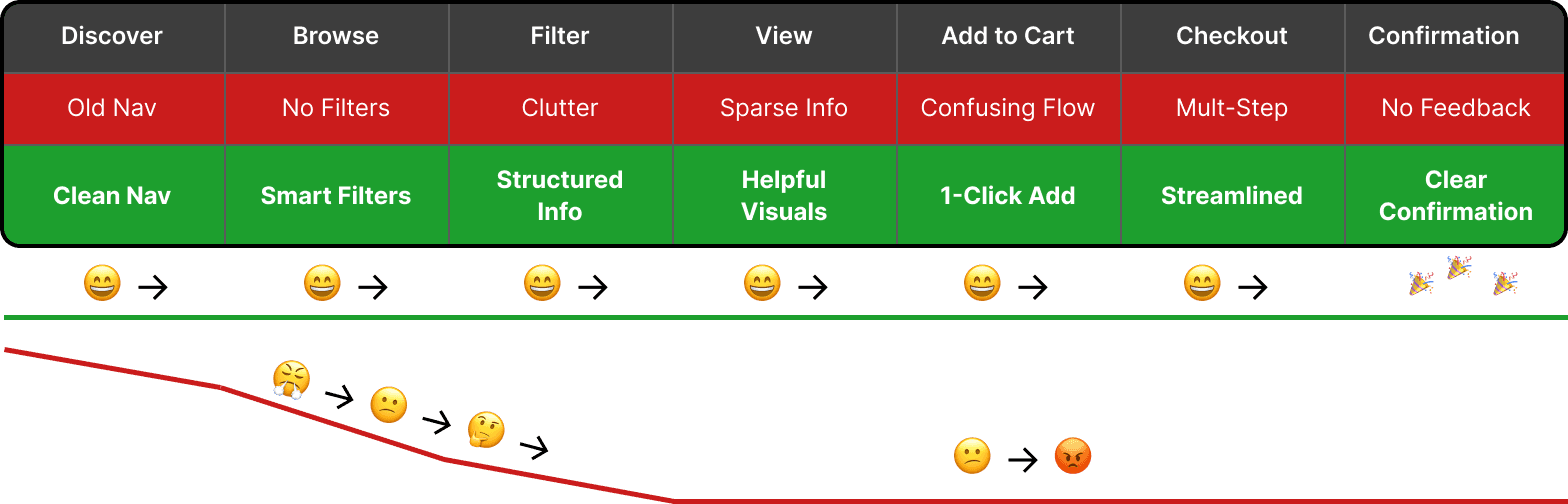
Why does this matter? Users weren’t dropping off because of a single issue—frustrations built at every stage. By improving navigation, clarity, and trust, I was able to create a more enjoyable and effective experience.
Delivering Impact
The redesigned e-commerce platform transformed toy shopping from an overwhelming experience into a structured, intuitive, and confidence-building journey. By improving search, navigation, and trust-building features, the new design helped parents and gift buyers easily find and purchase high-quality toys—without frustration.
UX Enhancements That Made a Difference
✔ Better Product Discovery – Users could browse by age, activity, and category with clear filtering options.
✔ Improved Search Functionality – More accurate results and predictive search suggestions.
✔ Trust-Building Elements – Clear in-stock indicators, secure checkout messaging, and verified customer reviews.
✔ Streamlined Checkout – A simplified, faster checkout process with guest checkout options.
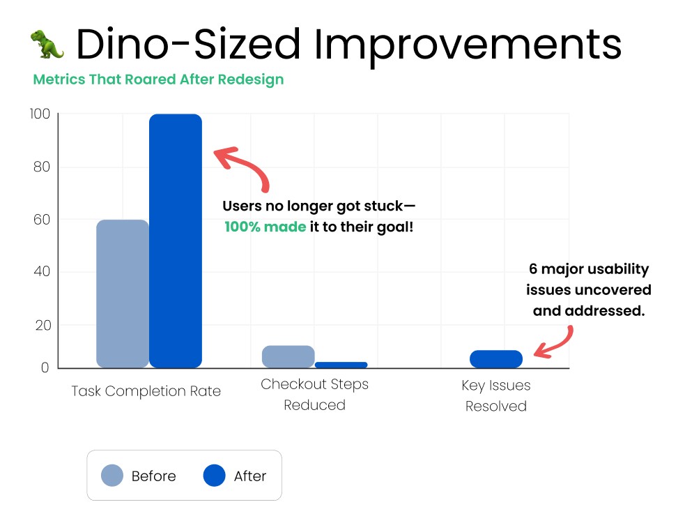
Usability Testing & What We Learned
📌 Participants & Methodology
✔ Evaluated how quickly users could find, evaluate, and purchase a toy using the new prototype.
📌 Key Insights & User Feedback
🗂️ Users wanted better sorting options within categories.
✅ They appreciated in-stock indicators for decision-making.
⚡ The new checkout flow reduced confusion, making purchases faster.
UX Should Be Fun
Designing for Engagement
📌 Making E-Commerce Feel Playful & Intuitive
✔ This project wasn’t just about fixing usability issues—it was about creating a delightful, engaging shopping experience that matched the brand.
✔ When designing for children’s products, it’s important to reflect that sense of fun & discovery in the UX itself.
✔ The project aligned with my design philosophy—creating experiences that are approachable, engaging, and easy to navigate.
✔ Even in my presentation, I leaned into this spirit—opening with: "Today, we get to talk about dinosaurs—this is why UX is so cool!"
💡 Takeaway: Great UX isn’t just about usability—it’s about creating an experience that feels intuitive, engaging, and enjoyable for the user.
Honing My Visual & Sketching Skills
📌 Taking Wireframing & Ideation to the Next Level
✔ This was the first UX project where I really pushed my sketching & wireframing skills.
✔ I focused more on line work, explored different tools, and made dedicated space for sketching at home.
✔ This process led to long-term improvements in how I approach early-stage ideation.
💡 Takeaway: This project deepened my commitment to sketching as a fundamental UX skill, shaping how I now approach early concept development.
A Milestone
Confidence in Delivering
📌 From Research to Execution – Seeing the Full UX Process Come Together
✔ This project marked a turning point in my UX journey—where research, strategy, and execution all came together.
✔ The final prototype delivered on the project goals, improving usability, shopping flow, and search experience.
✔ Seeing the final version validated that I could take an e-commerce problem, apply UX research, and deliver a solution that worked.
What I loved about working on this project was that it helped solidify my ability to critically evaluate UX problems, execute research-backed solutions, and create an engaging experience.