When Clarity Brews Better UX
Everyday design patterns are often overlooked, but they shape the way we move through digital experiences. In this short audit, I compare two coffee apps—Starbucks and SummerMoon—and how small UI choices create (or remove) friction when ordering your favorite drink.
It’s a reminder that thoughtful UX can transform even the most routine interactions.
☕ Starbucks
A global coffee chain known for consistency, scale, and seasonal drops.
The Pattern
– You open the app and are greeted with: “Can we get something started for you?”
– But nothing happens when you tap it.
The Problem
❌ The greeting looks tappable but isn't—false affordance → “Start Order” is visually downplayed.
❌ No guest path—forces login early.
The Rethink
→ Make greeting interactive or remove.
→ Visually prioritize “Start Order”.
→ Add visible guest order flow.
☕ Summer Moon
A Texas-based coffee shop with a cult following and a strong visual identity.
The Pattern
–The CTA on the store selection screen simply reads: "Order"
The Problem
❌ Unclear whether tapping "Order" places an order or selects a store.
❌ Could lead to hesitation or misclicks.
The Rethink
→ Change CTA to: "Order From Here" or "Select This Store."
→ Add helper text: "Items are chosen on the next screen."
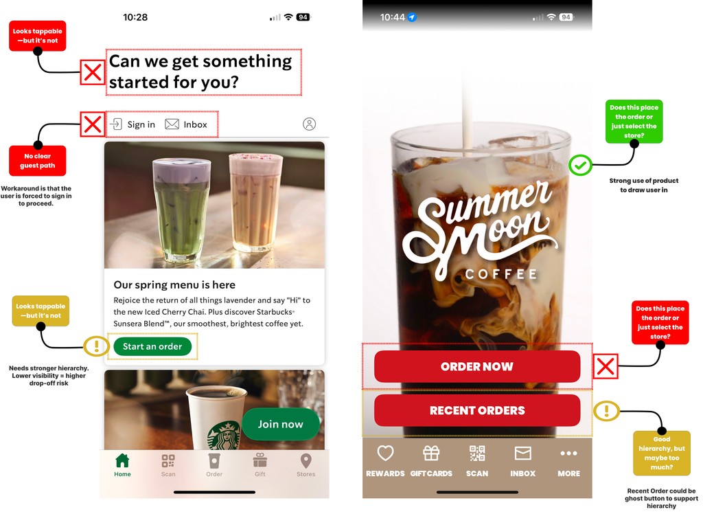
Annotated Interface Comparison
This annotated comparison highlights how small interface decisions shape the ordering experience. Starbucks opens with a friendly message that feels like a CTA but isn’t—causing momentary hesitation.
Meanwhile, Summer Moon leads with strong visuals but stumbles with a vague “Order” button. These callouts reveal that even when the UI looks polished, clarity and intention in microcopy and interaction flow are what truly support a smooth user journey.
These are small shifts, but they have a big impact. Clearer calls to action reduce friction and build trust—especially in moments when users just want to place an order without overthinking it.